- Brand Revitalisation
- Quantitative Research
- Rebrand Strategy
- Verbal Identity
- Visual Identity
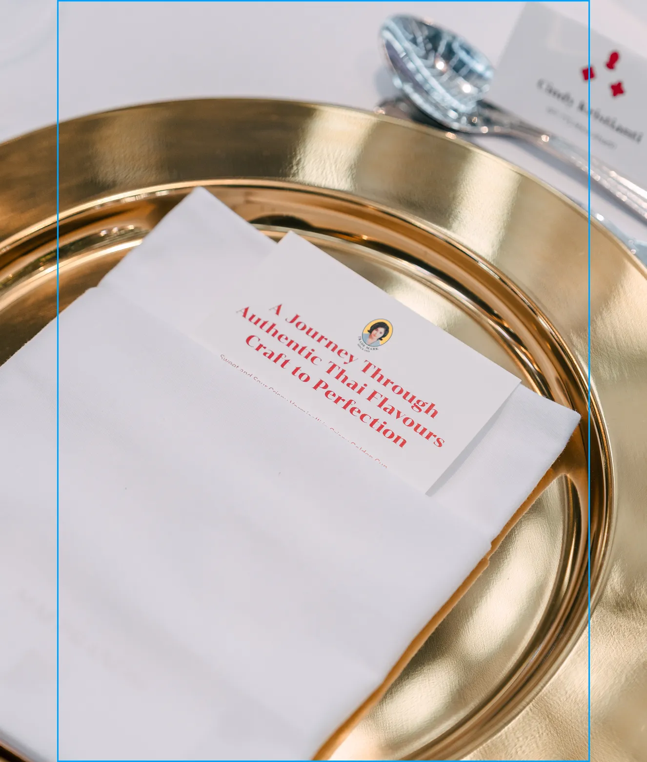
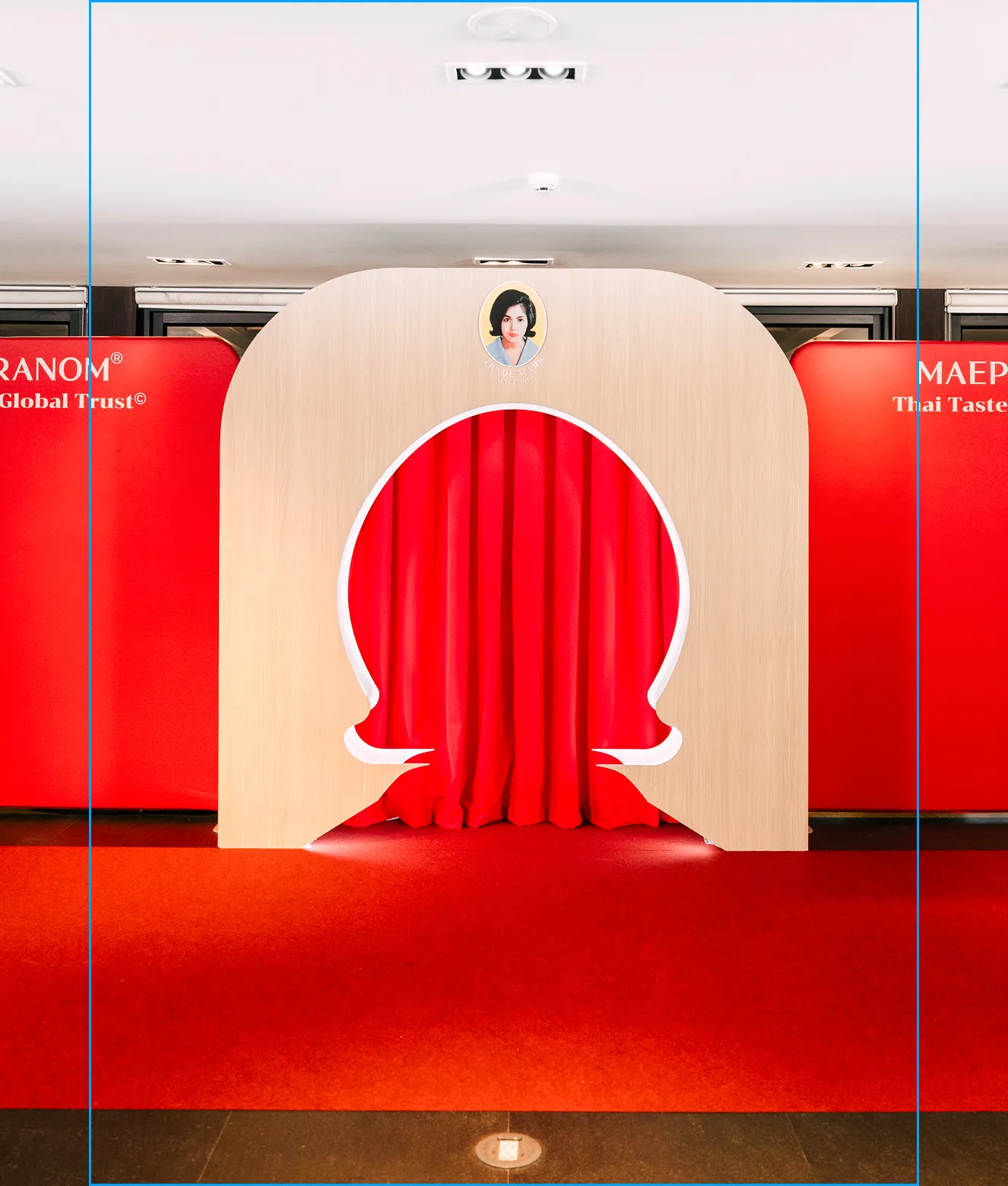
- Experience Design
- Food & Drink
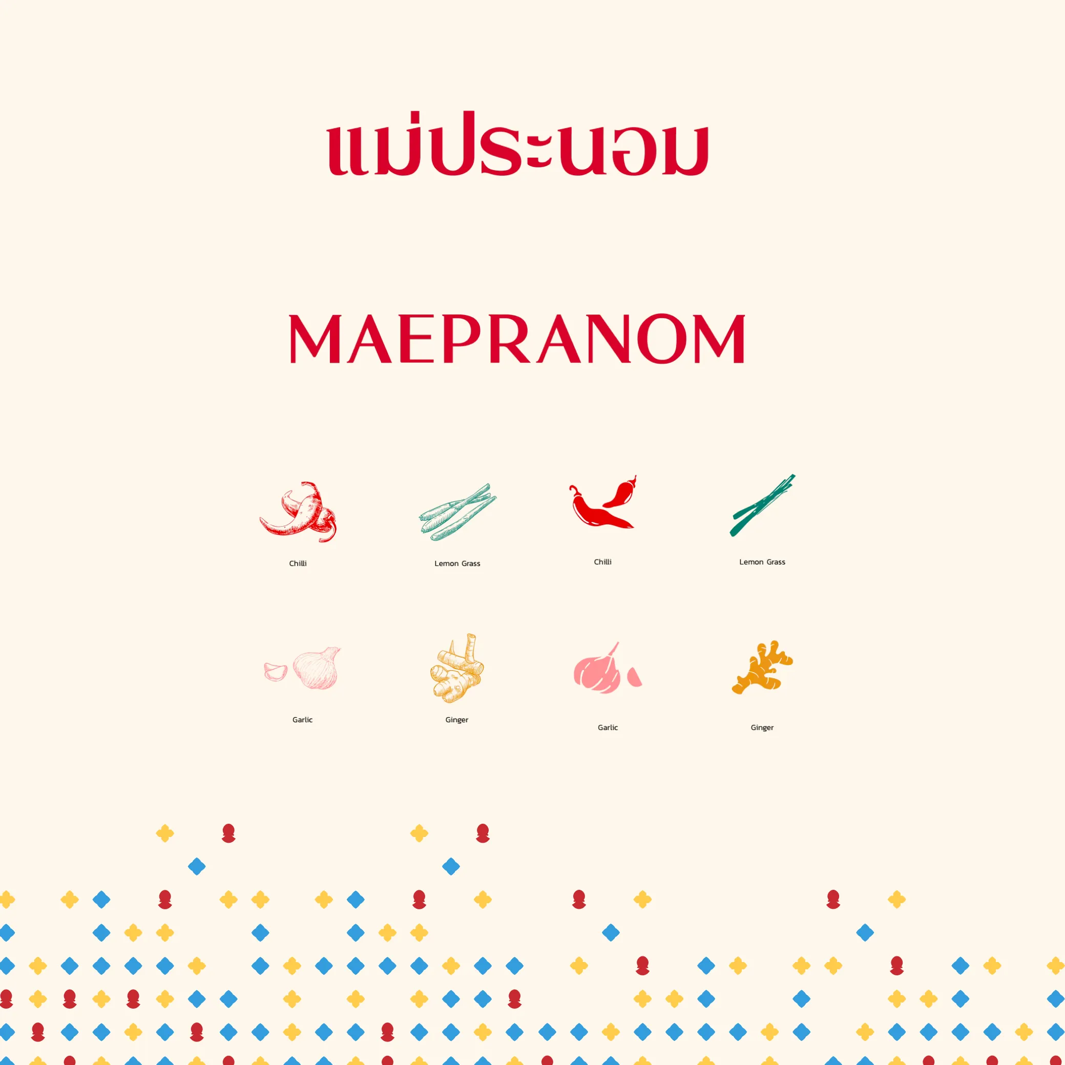
MAEPRANOM
When the next generation took stewardship of Maepranom, they inherited a 60-year legacy that was a household name at home and a question mark abroad. They successfully modernise Maepranom in the Thai market and new generation consumers. However, across export and B2B channels the brand fractured — a different look, message, and perception in every market. Leadership's vision was clear: claim the global benchmark for Thai flavour without softening the recipes that made the brand loved in the first place.
Every Thai food brand on a global shelf leads with the same word: authentic. It has become a category reflex, not a position — printed on every label, owned by none. Maepranom's leadership understood the difference between claiming authenticity and proving it. The question nobody in the room wanted to raise was blunt: what makes us the standard, not just one of the options?
The audit answered it. For sixty years, Maepranom had never softened the heat, the salt, or the depth of flavour to court a wider audience. That refusal — quiet, stubborn, undocumented — was the most defensible position in the category. The competition wasn't another paste on the shelf. It was the brand's silence about its own conviction.
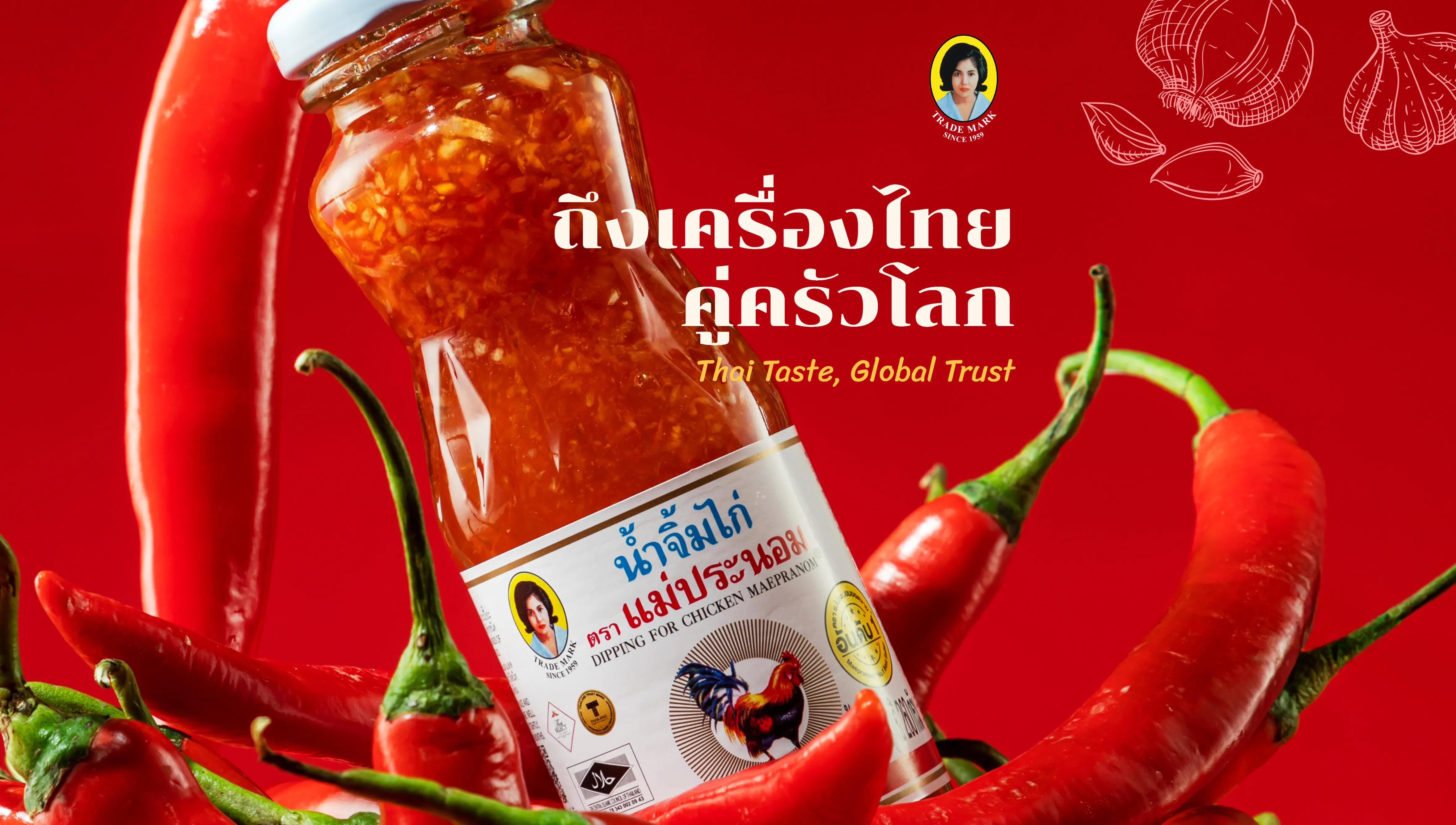
We ran a brand audit. The insight crystallised in one Thai word — ถึงเครื่อง, the intensity that signals a dish has been made right. That led to the positioning "Thai Taste, Global Trust," the archetype of The Ruler, and a mission that travels: ถึงเครื่องไทย ทุกครัวโลก — Authentic Thai Intensity, For Every Kitchen in the World.
Authenticity was table stakes, not differentiation. Claiming it would put Maepranom in a chorus of identical voices, competing on adjectives instead of authority. The move that mattered was to claim the benchmark — to position Maepranom not as another authentic option, but as the standard the category is measured against. Less folk story. More command. That call shaped every word, colour, and pattern that followed.
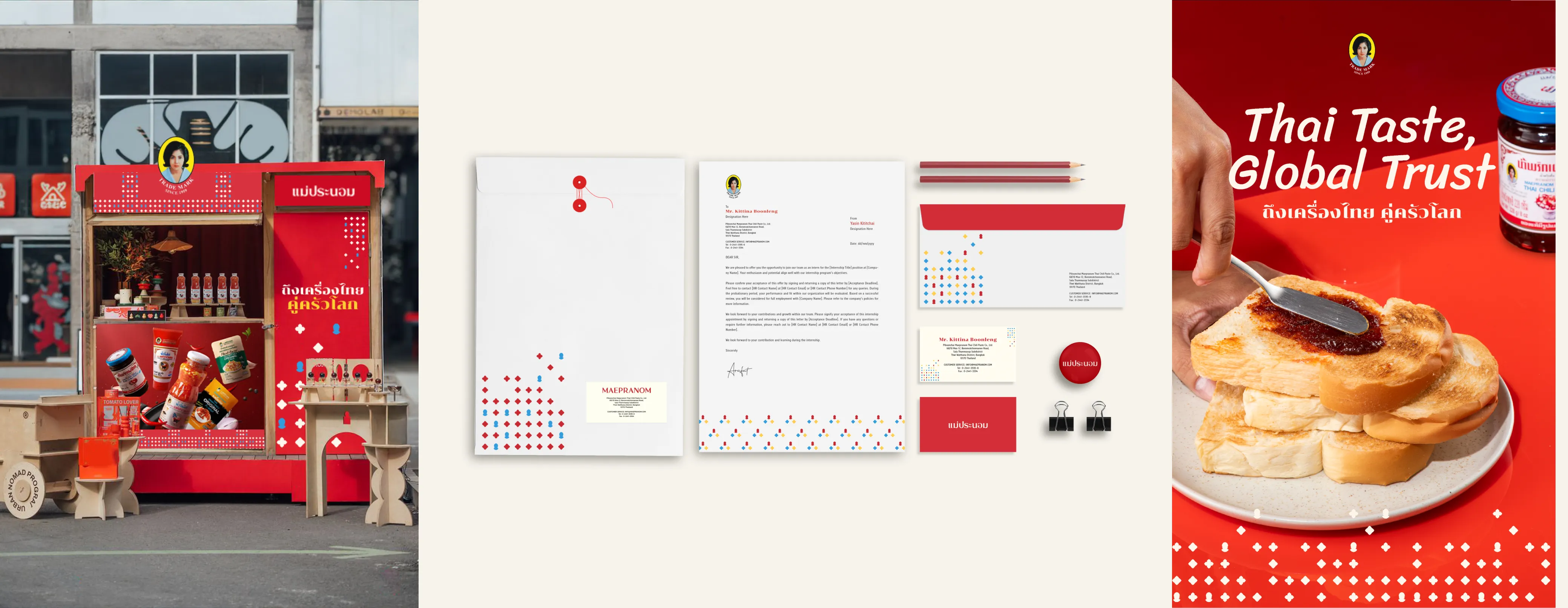
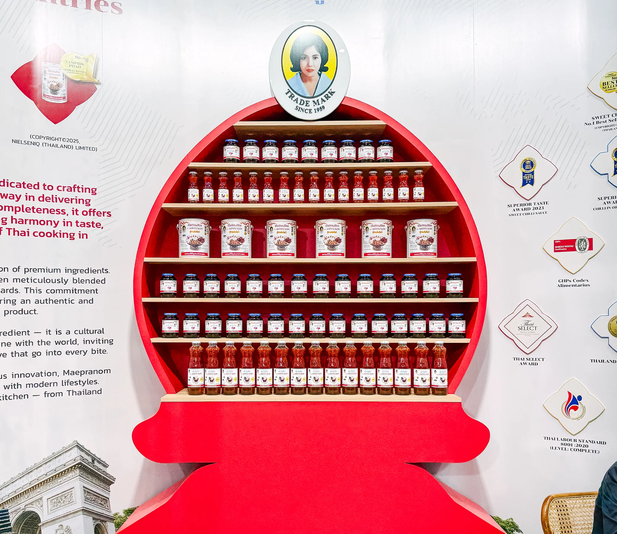
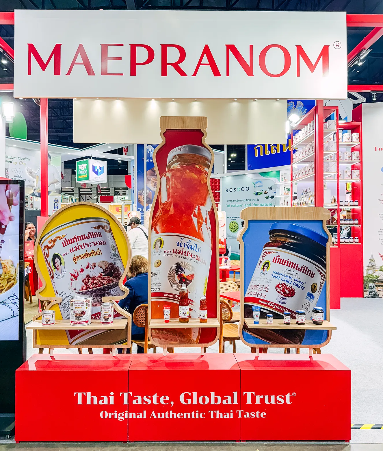
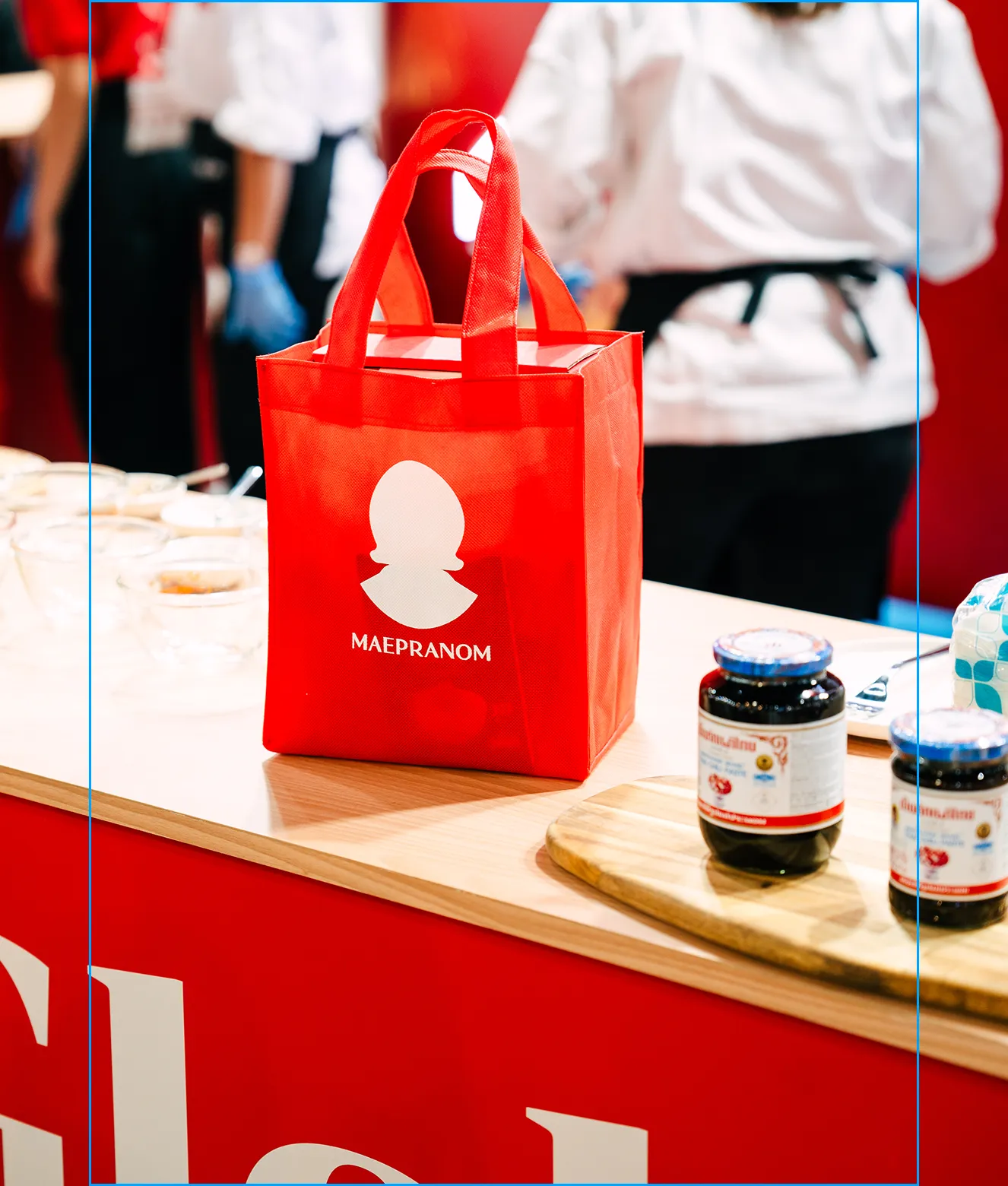
A refined logotype that keeps the equity and gains the clarity of a global mark. A palette of spicy red and heritage blue — heat that speaks for the product, blue that carries six decades of trust. A proprietary brand pattern that reads traditional Thai motifs through a modern lens and signs the brand on every package and sell sheet.
Before the rebrand, Maepranom showed up differently in every market — a beloved icon on Thai shelves, an inconsistent participant abroad. Today the brand holds one recognisable system from Thai retail to international foodservice. The expression is unified. The position rose with it.
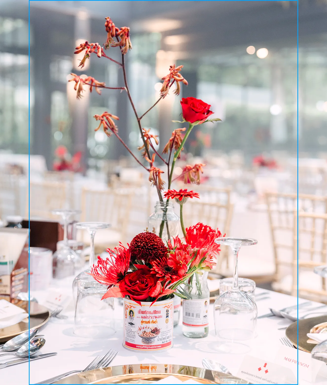
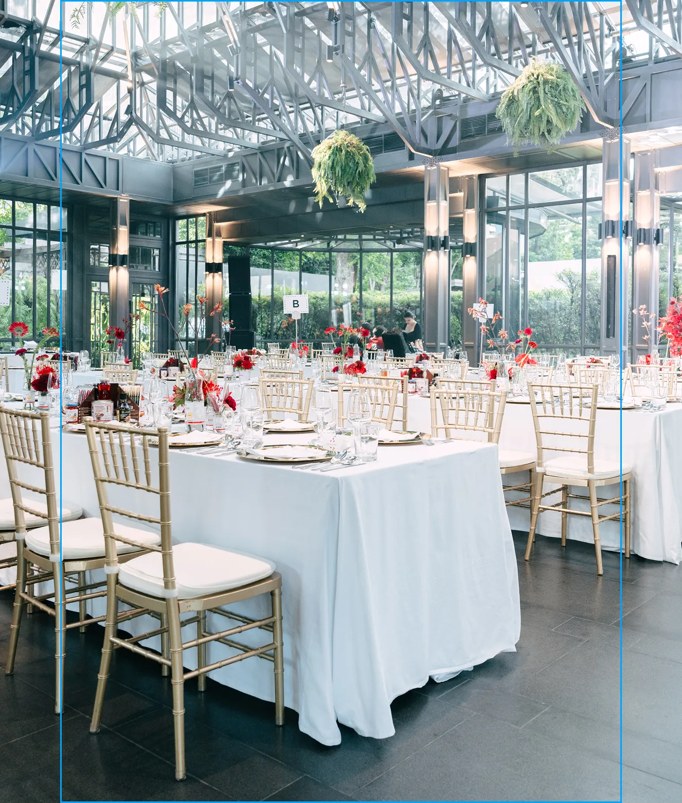
Since the rebrand, we have continued working with Maepranom on export market adaptations and events, building on the system across new product lines and trade channels.
Maepranom now leads on a position no competitor can credibly claim — earning its international growth, not asking for it.
Got an idea we can help with?
Tell us about your business, let’s work together.
get in touchMore Works
- 360º Rebranding
- Quantitative Research
- Rebrand Strategy
- Brand Architecture
- Verbal Identity
- Visual Identity
- Packaging Design
- Food & Drink
BUILD
_________
BRANDS

Un-titled Lab Co.,Ltd.
38 Sukhumvit 69 Alley,
Phra Khanong Nuea, Wattana
Bangkok 10110, TH
(+66) 2 161 0252


